The “Pop of Color” that Suits your Style
Different colors bring out different emotions for people, and when designing or re-designing a home, color is often the first element that homeowners think to change. While color can be the most fun element of design, it can also be the most tricky to handle.
When we help our clients decide on colors, we don’t just pick the trendy “pop of color” but we study how each space in your home will be used and how you want that space to make you and your guests feel. Then we take it from there.
We know each room may warrant a different feeling and energy so the colors selected for each space in your home should be forward-thinking and not a trend that will fade out in a few years. So whether you’re known for your bold, or subtle personality, we’ll help you narrow down the best color palettes, that suit you and your space. Here are a few that we have found to stand the test of time…
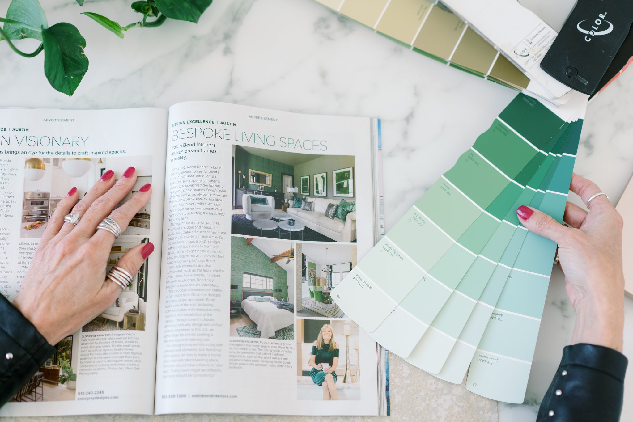
1. GRAY-GREEN & EARTHY TONES
After the pandemic shook the world a bit, many of our clients are looking to bring peace and serenity into their homes, so it’s no surprise that this color palette has increased in popularity in many spaces. This palette can be used in so many different ways - as an exterior, as an upholstered piece, as a paint palette, custom bedding, and even for custom window treatments - and every time, it looks so beautiful and brings so much peace to a space.
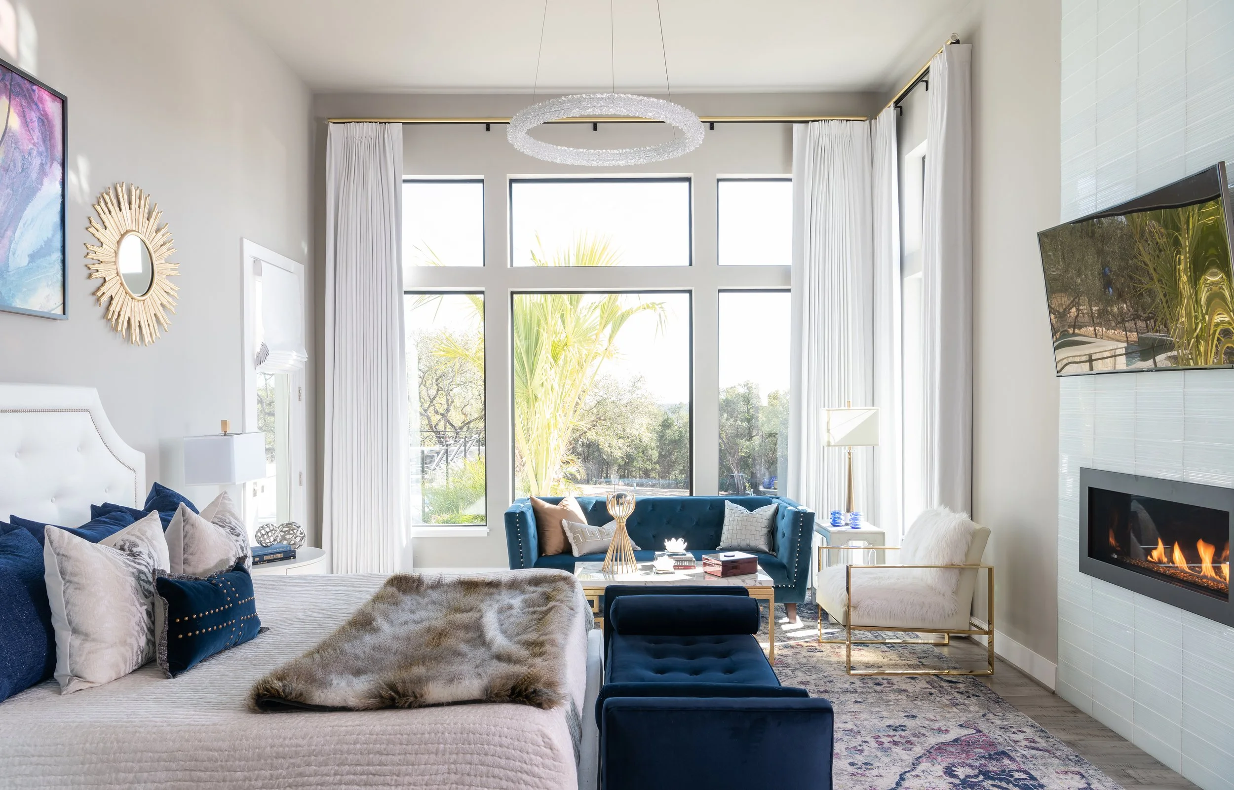
2. SENSUAL & CITRINE TONES
For those spaces that get more traffic than others, this palette lends tremendous power. While we don’t recommend it for spaces used for resting or to focus (bedrooms, studios, offices, libraries), it’s a great way to bring some energy into spaces that you’d want to feel elevated in, like your gym, home bar, or even when used in small batches in your kitchen. As we mentioned before, color brings out different emotions in people, so a space that is often shared with others would be the perfect placement for this palette.
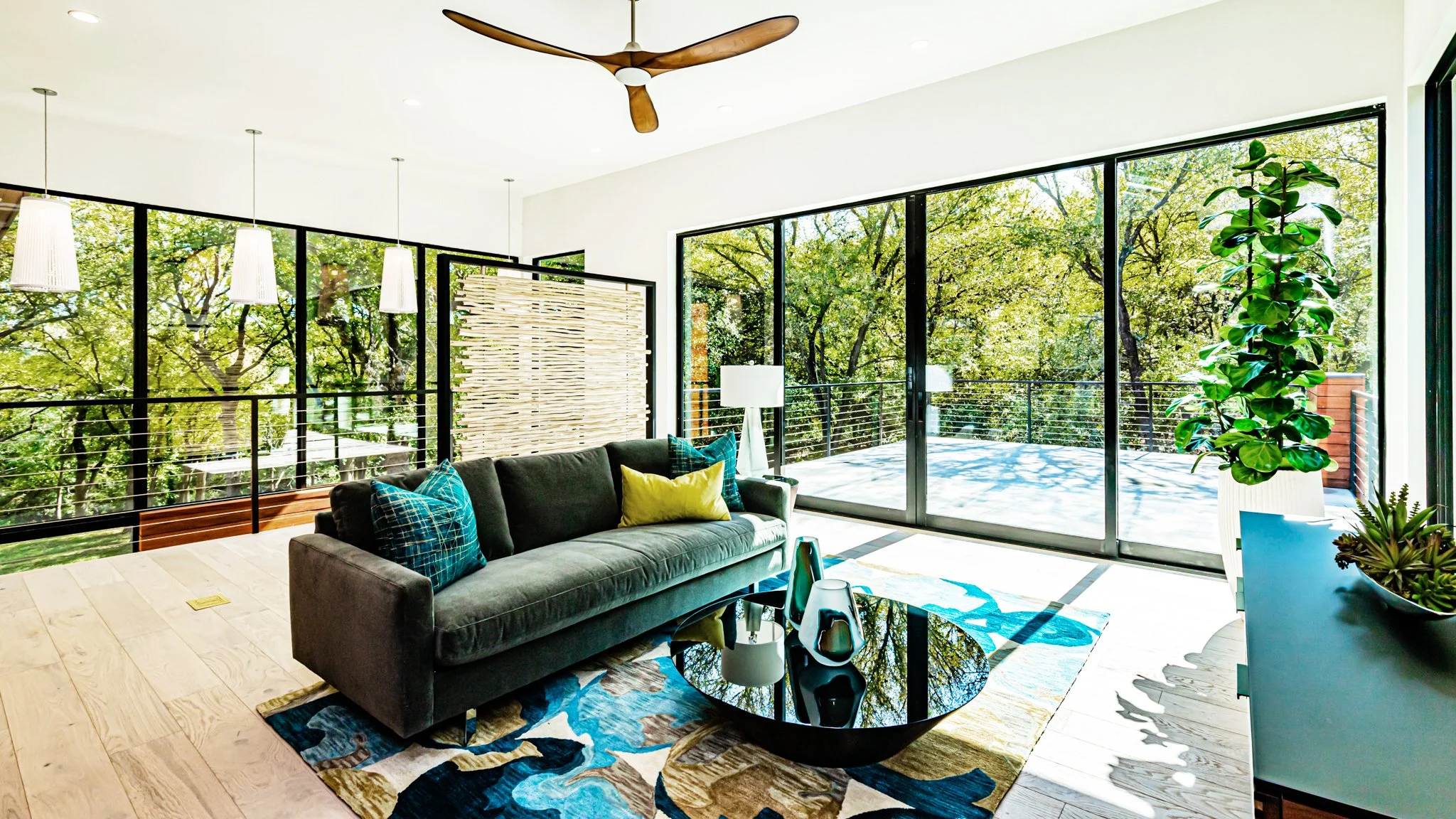
3. NEUTRAL & ELECTRIC TONES
Even though the words “neutral” and “electric” are opposite by literal definition, it’s incredible what the combination of the two can do for an otherwise calm palette. It adds just enough energy and focus to a home office, a children’s school room, or even the laundry room. Adding just a sprinkle of electrifying color, whether that be in wallpaper, upholstery, art, or bedding, is a fantastic way to show off your bright and playful side. Balance is key with big, bold, and beautiful colors and that’s why we love pairing it with calming neutrals or even pastels.


